Design Tips for Jumbo Printing
Most jumbo printing is intended for long-distance viewing. You want people to see and understand the content without walking up to it to read it. This means the text should be easy to read and the design should be attractive to catch the eye. Whether you have an office-size printer or a jumbo printer, it needs to be well maintained by services for copy machine repair in Las Vegas Here are four things to consider for effective jumbo prints.
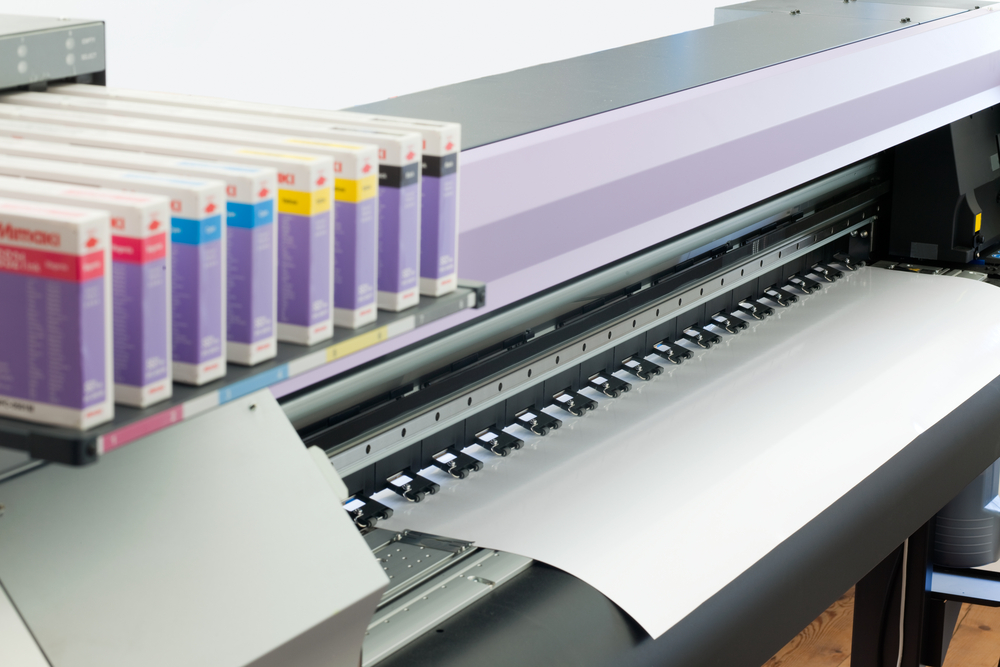
The Right Printer
Printers use vectors and bitmaps for printing. For normal office documents, bitmaps are fine, but for large-scale prints, vectors are needed. As bitmaps are enlarged, the image is distorted and the edges look blocky or jagged.
A vector image retains its sharpness when it is enlarged. Vector image files are smaller than bitmap files. This makes it easier to print the same file several times. It also reduces the time you need to upload and download.
The Right Font
If you want people to be able to read the text from a distance, you need to use a large-scale font. Some fonts don’t read well when they are enlarged. The space between words may be reduced and the words look crowded together. Thin fonts may be difficult to read from a distance even when they are enlarged.
You can test readability by putting the enlarged font on your computer and backing away several feet or yards to see if it is readable.
Color and Design
The general rule about color and design is to have a background color that contrasts with the graphics and text. This will make it easier to see and read. For most posters, a three-color pallet is enough, but if the poster is for an event, you may want to use more colors. Another general rule is the CMYK color software is more accurate than the RGB color software.
Other tips include keeping space between the graphics, using simple graphics like line drawings and don’t overload on the text. If you keep these things in mind, you will have a great-looking jumbo print.